
Mastering Evolving-Hockey: Data Pages and Live Game Analysis Explained
Mastering Evolving-Hockey: Data Pages and Live Game Analysis Explained
Continuing Our Hockey Analytics Overview and Information Series

Quick Update With Garret
There isn’t too much to report at the moment. As I mentioned earlier, I was away traveling for a few days—twice over the past two weeks. This caused a bit of chaos, especially when I forgot my laptop charger in another city. Fun times!
I'm back in Vancouver as of two days ago (as I write this—three days ago as you’re reading). It was nice to see and visit family. My two little girls really love spending time with their grandparents and cousins.
Other than that, there isn’t much to update on in my personal life.
Trending Winnipeg Jets Topics
This section will be on hold unless there is major, topical news to discuss. This will allow more time and space for the larger Analytics Overview Series, which is starting back up.
Analytics Overview Series: Parsing Through Evolving-Hockey.com
For those who aren’t familiar, Evolving-Hockey is a hockey statistical database and website created by Josh and Luke, twin brothers who happen to be fans of the rival Minnesota Wild. It’s a fantastic site and one of the four I most commonly visit when doing research for The Five Hohl.
Some sections of their site are free to use, but to access other features, they require a subscription to help keep the lights on.
Below is the pricing for their subscription tiers, and you can click this link to see the features each tier includes:

Full disclosure: I reached out to all four websites for this series. The reception was positive, with some offering to provide something in turn. However, not all who wished to do so could, due to logistical issues or the short time frame.
I’m doing this because I genuinely want to help everyone learn. I also wholeheartedly believe that a rising tide lifts all boats. I will always disclose any discount codes or perks I receive from these sites, if any. But just so you know, all of these sites are run by people I greatly admire, and they deserve your support if you're economically able, willing, and find value in what they offer.
And on that last point—finding value—hopefully, this series will help with that.
Quick History
Josh and Luke began their journey into hockey analytics on Twitter, analyzing contract efficiencies by comparing CapFriendly data to Dawson Sprigings’ (DTMAHart) WAR model. After Dawson was hired by the Colorado Avalanche, they started building their own model and website: Evolving-Hockey. (They also wrote on a site called Hockey-Graphs, founded by a certain Winnipeg-born smart-ass who, despite his flaws, is fairly handsome!)
Over the next few posts, we’ll dive into their excellent site, explore some of its features, and discuss how I use it for my analysis.
While some of this might seem a bit dry, I’ll sprinkle in tidbits, tips, content details, and some fun facts. The goal is to make this informative for those new to hockey analytics and engaging for the long-time believers and practitioners.
THE STANDARD DATA PAGES
SKATER TABLES
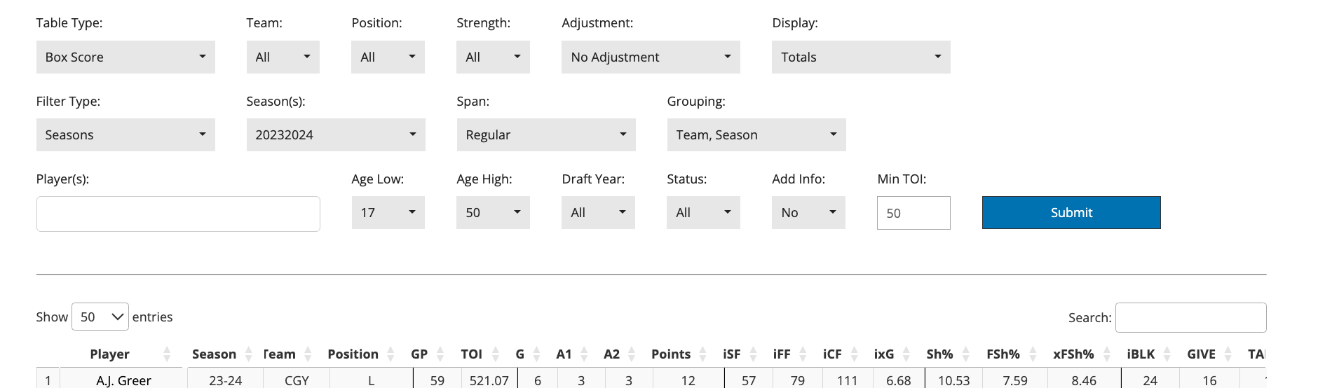
The skater tables are your standard, run-of-the-mill hockey stats spreadsheet, made filterable and sortable for your viewing pleasure. You can’t be a basement hockey nerd who thinks he knows more than pro scouts and GMs without your spreadsheets.
The skater page allows you to filter most of the basic, and some of the “advanced,” hockey statistics one would want to have available.
Before diving into the available stats, let’s cover the different filters.
Table Type: Box Score, On-Ice, Relative to Teammate, Zones:
This option changes which of the four available spreadsheet tables you are looking at:
Box Score has all the basic individual statistics you'd expect to see on a game sheet—goals, assists, blocks, hits, face-offs, etc.
On-Ice shows team statistics for the duration a player is on the ice, like goal differential and Corsi, to indicate how well a team performs with that player on the ice.
Relative to Teammate (RelTM) compares teammates’ on-ice statistics with and without a specific player, answering whether the player makes their linemates better. Fun fact: this stat is highly correlated with RAPM (see next time), as making your teammates better is a significant factor in that model.
Zones provides insights into the intentional and unintentional deployments a player experiences.
Team, Position, Filter, Season, Span: To save time, I won't go over the more obvious or intuitive filters. I’m sure you can figure this out. :)
Strength: This filter allows you to select which situations (e.g., 5v5, power play) you want to analyze. Note that Evolving-Hockey uses the more colloquial hockey analytics definition of Even Strength (EV), not the NHL’s. The NHL includes goalie-pulled situations, while in hockey analytics, we prefer comparisons with equal numbers of skaters.
Adjustments: There are two types of error in data tracking: accuracy (bias) and precision (consistency). Precision errors are randomly distributed and can often be overcome with larger samples, while accuracy issues require adjustments. Venue adjustments account for arena-specific tracking tendencies, and score adjustments account for teams playing differently when tied, trailing, or leading.

Display: Totals, Rates, and Percentages
The way you view the data matters, depending on the question you want to answer. Looking at a player's point totals might tell you Kyle Connor scored more points than Nikolaj Ehlers, but point pace (points per hour or per 60 minutes) reveals Ehlers scores more given the same ice time.
Fun fact: Before "per 60 minutes" became the standard, many hockey analytics websites displayed numbers "per 20 minutes."
Most On-Ice metrics are viewed in terms of percentages (e.g., Corsi for / all Corsi events) and rate differentials (e.g., Corsi for - Corsi against). Both have their uses.
Rates can be more effective when accounting for ice time and game pace. A more defensive player (e.g., Alex Iafallo) may adopt a style that minimizes offense for both teams. The Jets might have a relatively high share of goals when looking at percentages, but those goals occur infrequently enough that the differential is closer to zero compared to other players with similar Goal%.
Percentages are most useful for easily comparing different metrics and providing an intuitive scale. All shot and goal metrics have 50% as a middle-ground performance, 60% as elite, and 40% as relatively weak. Even I couldn't tell you off the top of my head what constitutes a good Corsi +/- or Goal +/- per hour.
Grouping: This is intuitive, but just to clarify: this determines how the data will be grouped for a player. For example, Tyler Toffoli played for Winnipeg and New Jersey last year. You could look at just his Winnipeg stats or combine the two. You could also combine this and last year's stats.
Player Filters: There are filters to sort players by age, draft year, or rookie status. You can also filter specific player(s) and set a minimum ice time threshold. There is also a search function that is different than the player filter function.
The Stats
Evolving-Hockey has a glossary (see here), so I’m not going to go over every stat and Evolving-Hockey has a glossary, so I won’t cover every stat, but I'll briefly mention the ones I tend to look at the most:
Points: Goals, assists, and points are less meaningful than people think, but they still matter. Points are microstats, like zone entries and exits, measuring individual actions but not necessarily how good or bad a player is.
Shot Metrics: Corsi measures shot volume, one of the three outcome measures (the others being shot quality and finishing/setting/goaltending). Expected goals adjust for shot quality factors like distance and angle. Goals introduce both finishing/setting/goaltending and "luck."
Shooting Percentages and Regression: Players tend to regress to their individual historical averages when adjusting for shot quality. Goals are rare and goaltender performance is highly volatile. Simply put, a player may have a better shooting percentage one season, but they'll likely regress to their specific historical mean as the sample expands.
Zone Starts and Face-Offs: Zone starts give insight into a coach’s deployment strategy, while face-offs include both planned starts and those resulting from in-game situations, like getting caught from icing the puck.
GOALIE TABLE

Most of the filters here are similar to the Skater Table. The biggest difference is in the metrics available. Again, I won’t go over every stat, but here are a few highlights:
Save Percentage (Sv%) and variations: Save percentage is the traditional stat, but there are reasons to include missed shots and use Fenwick save percentage instead.
Evidence suggests that good goaltending forces players to take harder shots, causing more misses.
It also increases sample size, which is meaningful since it accounts for the effect of forcing misses.
Finally, it allows one to compare goaltending performance relative to expectations given shot quality. Expected Fenwick Sv% is what we’d expect an average goaltender to do if the shooters were all average, while Delta Fenwick Sv% is the difference between reality and expectations.Goals Saved Above Expected (GSAx): This measures overall value performance, compared to dFSv%’s focus on value per shot.
TEAM TABLE
There are three tabs under the Team Table page:
Stats: Similar to the Skater Table but for teams.
G+/- Components: This tab breaks down a team’s performance into shot quantity, shot quality, and finishing/goaltending, providing valuable insights. For example, this table shows that the Jets were only marginally better defensively than league average in shot quantity and quality but had significantly better goaltending.
Standings: A standard standings table.
LEAGUE TABLE
The League Table is similar to the Team Table but compares different seasons in the league. It’s useful for validating claims like "shot rates are down but goal rates are up."
PLAYER PAGES
To be honest, I don’t use these player pages much, but they are neat in that they provide a snapshot of a player’s career stats across multiple tables.
GAME PAGES
LIVE GAMES
Live games let you see stats and visuals for specific games happening that day, with updates provided in real time as the game progresses. I find that keeping an eye on these while you watch a game can be highly informative and helps sharpen your “eye test.”
Overview
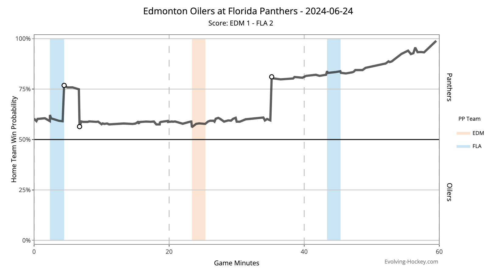
The Overview Page begins with the win probability chart. Here, we can see that the Florida Panthers started the game with a slightly higher chance of winning, primarily because they were the home team.
Their win probability took a small jump when they went on the power play, and it increased significantly when they scored. Edmonton then tied it up, causing the probability to dip slightly.
The game remained tied for a while, but then Florida scored again. This jump in win probability was larger since it occurred later in the game—where a one-goal lead becomes more significant than in the first five minutes. The one-goal lead continued to grow in win probability as time ticked down, and eventually, the Panthers won the cup.
Further down on the Overview Page, we see the major events of the game: goals, non-goal shots with high expected goal chances, penalties, and other key factors impacting win probability.
Finally, we get a few tables summarizing the game’s stats for both teams and their players.
Cumulative Charts
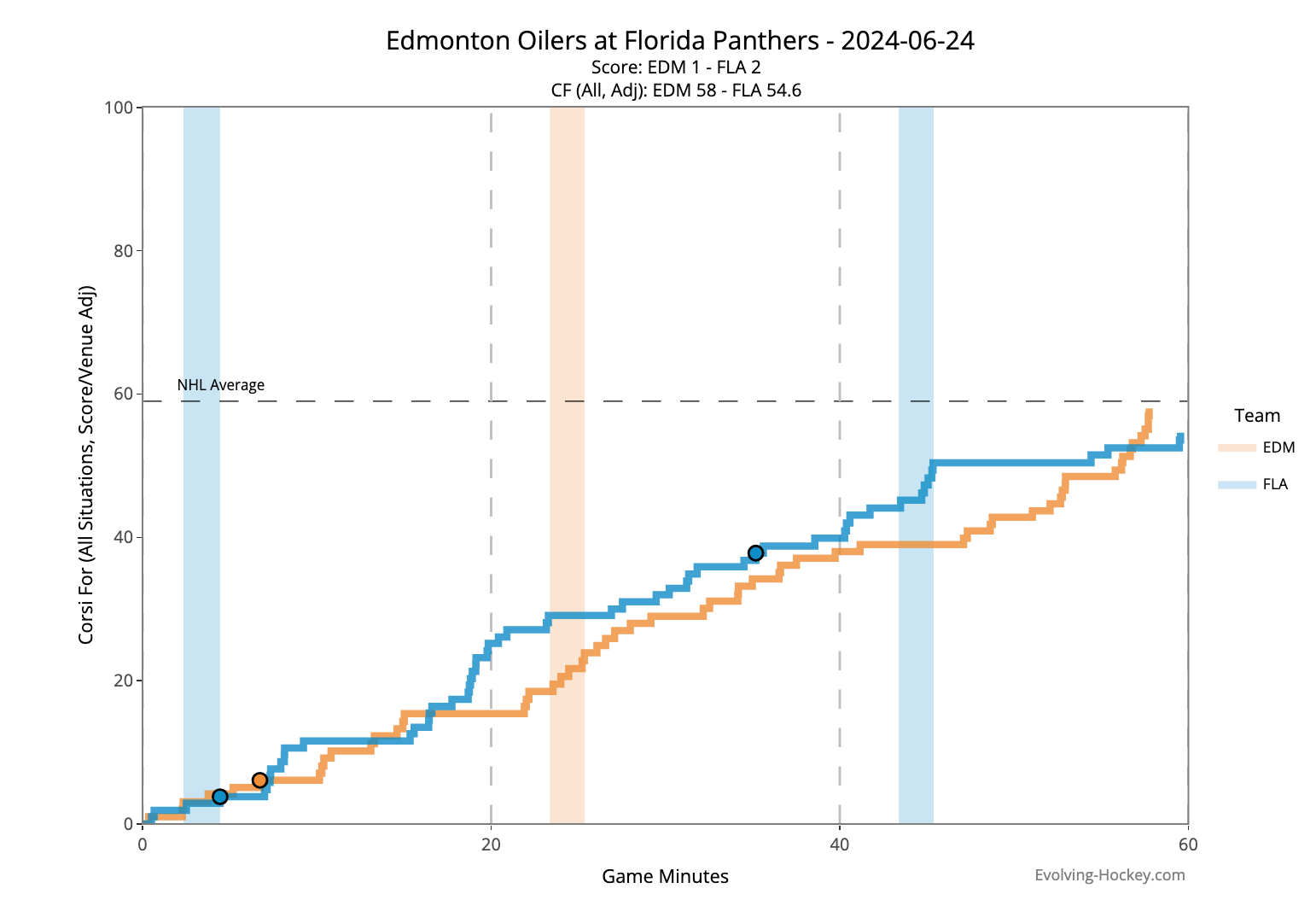
The cumulative charts display shot counts (either Corsi or xGoal) as the game progresses. They help visualize the momentum and swings for each team at different points.
For example, you can see how Florida had an edge in shot attempts for most of the game until they shifted to a defensive mode at the end, while the Oilers pushed hard offensively.
Shot Chart
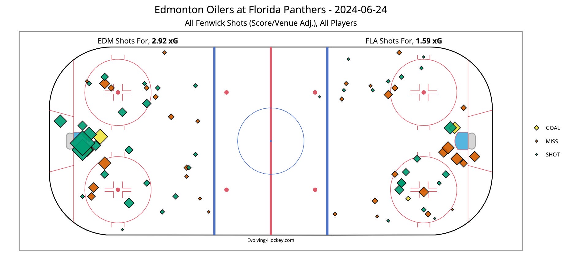
The Shot Chart page, as the name suggests, is a chart showing all the shots that occurred during the game. It's color-coded to indicate shot types—goal, save (shot), or miss. The size of each point represents the expected goal value, with high-quality shots appearing larger and low-quality shots smaller.
Skater Charts

The skater charts allow you to visualize player performance in either shot (Corsi) or chance (xGoal) differentials for that game. Players who were outshot are positioned near the bottom left, while players who outshot the opposition are in the top right.
It's important to note that being in a particular corner of the chart doesn't inherently mean a player performed well or poorly, nor does it mean they are a bad player. However, being closer to one corner than the other is unfavorable, regardless of the player's personal responsibility or the context of the game.
The situation is bad or good, but the player is only bad or good if they persistently provide those results, especially after accounting for environmental impacts.
Player Tables
Finally, we have the Player Tables. This page provides more of the data spreadsheets that we analytics nerds thrive on. More importantly, it offers detailed stats from the overview page, along with additional filtering options and details.
Series Thus Far
Closing Thoughts
That’s all for now. I plan to cover the more model-driven content (it’s a real word, I swear) along with visuals like RAPM charts and Player Cards in the next article. There’s a good chance with all the visuals and content to cover, next week’s post may not fit fully in your inbox. If so, just click the link and continue on the Substack website.
Thank you all for reading this summer format, which will continue through September until the regular season begins. We'll return to our regular, more structured 3 posts a week starting October 14th, with the regular season in full swing.
If you'd like to support my work here at The Five Hohl, please consider liking, sharing, and subscribing. If you want to support even more, consider joining the paid tier; I offer an additional post each week in the regular season, and other extras for paid subscribers. I hope to provide even more value to paid subscribers over the coming years.